Monday, 31 May 2010
WINE AND PHILOSOPHY
This is my Final Major Project of my Degree Show where i had to create 4 design labels each one dedicated to a philosopher. The brief was wine and philosophy. I came up with the idea of using the illusion of two faces creating wine glasses. Each label has the face of the chosen philosopher and a quote of each one related to debate,discussion,argument and opposition which are the fundamentals of philosophy. The brand of the wine series and the logo i created is linked with the theme. The word 'PHILOS' means 'friend' in Greek and the symbol is the greek letter 'phi - f '. Finally, a careful choice of typefaces and colors is done to represent the labels. The space in between was done by laser cut on the official labels, being able to see through the bottle the level of the wine.
Thursday, 27 May 2010
Redesign a product in a breakthrough way(DESIGN BRIDGE COMPETITION)
Thursday, 13 May 2010
MINI COOPER (Direct Response Advertising) / D&AD brief 2009-2010
The brief was to create a direct response advertising for MINI COOPERs campaign (5 MINIs-15 million variations). So, I came up with the idea to create a game for the new i-pad and all smart-phones and could even become a game on facebook, because my target audience is mostly young people, but either way almost everybody uses smartphones. The game is simple for everyone. An invitation will be sent to you from a friend that will invite and challenge you to pimp your MINI and race. You could colorize your MINI or draw on it whatever you want with the brushes and strokes provided and then free to pimp it and get crazy with it. You can name it with max of 7 characters and even international car codes would be available on the palettes. After pimping your MINI you would upload it to PIMP YOUR MINI gallery online (direct response advertising) and then you would race with other pimped MINIs. You could even have a test drive or a trial before you get started. The key point on this challenge is that you can vote your favourite MINI so the more votes you get the faster you get and you’re upgraded to better races, so friends would invite more friends and the voting/challenge would go on and on.
Cover Book design
This was a project for the Penguin and Puffin design award (Penguin and Puffin publishing UK) where we had to create the covers of those 2 very famous books.
For Perfume I created an atmospheric picture, and used decorative pattern of 18th century where the story is placed.
For Alice in Wonderland I created these optical effects and used these color palettes in order to broad my target audience and appeal both sexes and different ages.
Collaborative Project-Advanced Publishing: Teuthology
For this group project (5 persons) our theme was The study of Cephalopods where we had to choose between octopus, cuttlefish and squid. The brief was to create a limited-edition book, and we decided to create a children's book writing our own original story, creating a new unique character and all the illustrations. Final touches were the text and the cover that were screen-printed.
Intervention project
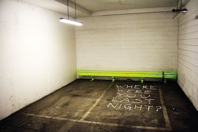
The First Feature I have made in the Northumbria Design Exhibition. Entitled "Out of Place" the project came about through a design intervention project. The brief was to demonstrate an engaging and subversive approach to design using any medium or form within a given space.
An environmental design intervention based in Newcastle– conveying a dramatic and mysterious love story through a non destructive form of graffiti.
Poster Theater Project
Corporate-Identity logo project
In this project I had to design a logo for Royal Botanical Gardens of Edinburgh and a ‘party theme’ for the opening of the Gardens.
The concept of the logo is a water lily and a crown at the same time representing the Royal Botanical Gardens of Edinburgh.
My ‘Party Theme’ was a tea party and I created different tea tags with the most famous flavours and having a brief history of each tea in each tag, so the Traditional Tea Time would be amusing and entertaining at the same time, because what’s better than Tea in the Garden;
Book project
In this project I had to ‘record’ a conversation out in the streets and then apply it on a book using only Black&white and typography. So, I heard a conversation in an underwear fitting rooms store and tried to give the aesthetics and mood of it to my book. I used mirror paper to give the effect of mirroring when needed and represent the ‘mirror/fitting room’ theme. The typeface I used is Helvetica Neue Std because it’s a clean, elegant typeface and gave the style I wanted.
Billboard posters
Subscribe to:
Posts (Atom)